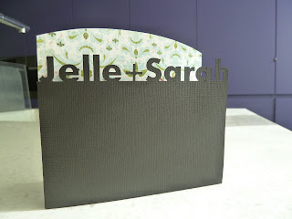
So... I need your advice!
I decided to make my own wedding invitations because the ones I liked on the internet were 3€/piece and I could easily make them myself... the only thing I needed was a silhouette. Not much to ask, right?
So last week I got a silhouette and started experimenting. The only problem is... the machine is too great! I can do way to much with it! So I made some samples and would love to hear what you think!
I'm planning on using all kinds of patterned paper for the letters in the background, so don't pay to much attention to that; it's the design that counts.
These are the ones I've made so far (in no particular order):
I've got a favorite... but I'm really curious to know what you think!
Thanks!
Love, me


fyne kaartjes.foto nummerke 3 is myn favoriet.
BeantwoordenVerwijderenveel plezier en succes!!!
groetjes uit duitsland
Sarah, these are beautiful! I like the ones that have the longer shape. . .seems more elegant for a wedding. The fourth one down would be my fave. Let us know which one you go with and have fun!
BeantwoordenVerwijderenHI Sarah, great job - you really have put the Silhouette to work :o)
BeantwoordenVerwijderenThey are all great but the one that appeals more to me, is the third one down, with the curved edge. It emphasizes your names really well. Look forward to seeing which one you decide on!
Hi Sarah these are fabulous and I love all your designs, I think my fav is the sqaure one in the middle row. Good luck you have quite a job ahead making all the invites!!
BeantwoordenVerwijderenGreat job! I saw these on flickr. I'm partial to the square one!
BeantwoordenVerwijderenThey are all great but my fave is the 2nd one that you show individually.
BeantwoordenVerwijderenThey all look great but my fave would be the square one, the second one that you show individually :)
BeantwoordenVerwijderengorgeous...I like the square one if you're looking for modern and classy. The curved one for sweet--but I'd change the + to a heart symbol if you can. The one I'd probably choose is the 4th one down in the individual pics. It's classy and not too girly or too modern.
BeantwoordenVerwijderenHave fun! You really can't go wrong with any of these btw!!
Wow - they look great. My fave is the square one - 2nd one. Good luck - I made all my own invites... stamped them all! Took AGES!!!! This looks like a better process. :)
BeantwoordenVerwijderenMooie kaarten! 'k Heb je post pas vandaag gezien (eventje ertussen uit naar Londen). Je hebt je keuze gemaakt en dat is ook de kaart die mij het meeste aanspreekt. Veel plezier en succes!
BeantwoordenVerwijderenThese designs are all wonderful but I like the 3rd one the best! Loving what you can do with a Silhouette.....cant' wait to see your choice.
BeantwoordenVerwijderenblessings!
4 en 5 dragen beslist mijn voorkeur weg ! Echt prachtig wat je met zo'n beestje kan doen !
BeantwoordenVerwijderen